Pretty vs. Pretty Effective—Do Your Infographics Help Tell the Data’s Story?
/Jock Murray recently shared a nice article from the Harvard Business Review: “Visualizing Trouble: Big data unleashed a torrent of infographics—most of them awful” by Scott Berinato. Berinato suggests that infographics are moving through its “awkward adolescence”—from A Flock of Seagulls and keytars to, perhaps, something more Daft Punk.
When I asked Jock what was his main takeaway from the article, he said: “Get rid of everything that doesn’t help the story you are trying to tell.” And he’s right. Storytelling is the key to communicating and presenting data dense information most effectively. In fact, it’s an important point David Zehren makes in his HT3M2: Helping Techs Talk to Mere Mortals presentation skills course.
“Get rid of everything that doesn’t help the story you are trying to tell.”
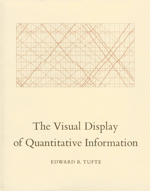
In the perennial classic, The Visual Display of Quantitative Information, Edward Tufte says, “Graphics reveal data. Indeed graphics can be more precise and revealing than conventional statistical computations.” There’s a lot to unpack in that statement. What counts for “graphics” (much less good graphics)? Text? Icons? Pictures? And “reveal” is an interesting word too. It’s clearly more than just visual representation. It’s about making something known that was previously unknown. And stories are great at helping us reveal things to others.
To convey information as a story, we must do several things that also help us make more effective graphics and presentations:
- Be as simple and clear as possible
- Focus on the main characters (subject matter)
- Organize sensibly
…and so on.
Any old chart can convey data. The promise of the infographic is to go further—to reveal. And good infographics do. There’s a reason Hans Rosling is as well known to presenters as he is to those who work with socioeconomics, health and other information about the world. He is a master of conveying research and data in powerful, memorable ways. Inevitably, his presentations and the supporting graphics and infographics tell a story and he gets rid of everything that doesn’t help communicate that story effectively.

Hans Rosling finds and presents world data points in succinct, clear, memorable ways. With laser focus, he tells the data’s story.
Our communications—including the infographics and other visuals we use to support our presentations—become clearer, more memorable and more powerful when guided by the story form.
ZEHREN♦FRIEDMAN offers a full range of presentation skills courses.
Read more here: http://zehrenfriedman.com/skills-training/present


