Powerful Presenters Engage the Hearts and Minds of an Audience

“Stories are data with a soul.”  —Brené Brown

Many aspiring presenters and presentations fail to connect with- and engage an audience by pursuing the misguided goal of conveying information from the mind of the presenter to the minds of the audience. For a presentation to succeed—to have lasting impact and meaning—a presentation must capture the *hearts and minds* of the audience.

In this clip from “Powerfully Persuasive Presentations,” Jock Murray defines an effective presentation as: “The transfer of emotions supported by data and logic.”  He highlights why presentations must engage both hearts and minds to be successful and gives strong, illustrative examples.


Transcript

You have to be reconditioned on the way you give presentations and on the way you design presentations. The way you’ve learned to present is by watching other presenters who aren’t good—your whole career.

So, let’s look at what you learned wrong. What you learned wrong is that a presentation is about getting the ideas from the mind of the speaker into the minds of the audience. That you walk in and you have lots of information. You have ideas. You have concepts. You have data. All this in your mind. And at the end of the presentation, that should be in the mind of the audience.  And if you do that well, they will clearly see it the way you see it and agree to what it is that you ask them for. 

If this is your approach, you will fail every time. 

The reason for that is that a presentation is not about the transfer of data. It’s about capturing the heart and the mind of the audience. A presentation really is the transfer of emotions supported by data and logic.

In other words, you go in to a meeting and you feel a certain way about the topic you’re going to speak upon: You’re excited about it; you’re nervous; you’re angry; you’re fearful; you’re worried; you’re enthusiastic. If it’s an important issue—important enough that you’ve put together a presentation and you’re going in front of some group that can make a change in this—you feel strongly in some way. Your goal is that at the end of the presentation they feel the same way you feel. And if they don’t, nothing will happen.

If you walk in passionate and enthusiastic and excited and they leave passionate and enthusiastic and excited, the likelihood of the change you’re requesting happening is considerably better. 

Your job is to transfer the emotions supported by data and logic. Obviously, data and logic are important. You can lose your audience if your logic and data doesn’t make any sense. But you can never win them with only data and logic.

This is true of every person. If all it took was logic—if all it took was data—no one would smoke. It’s not that we don’t have the data. In fact, a lot of people start smoking—many of you—when you went to college. So, you were smart enough and well enough informed to get into college and yet you thought it was a good idea to start smoking your sophomore year. It wasn’t a lack of information. If all it took logic, no one would smoke.

Stories are data with a soul.
— Brené Brown

Stories are data with a soul. The way the human mind works—we need stories. So your job in there when you go in to present is to tell a story. A story that tells what’s wrong with things the way they are. A story that tells how things could be different. And a story that tells what will be the positive outcome of life here if we make these changes. All supported by lots of data and lots of logic.

Visual Delivery Skill #3: Hands and Gestures

Presentation-Skills-Hands-Gestures.png

Presenters: Use Your Hands and Gesture Well… But Be Natural!

How we use our hands and how we gesture—or don’t—affects how we present, how we look when we present and how our audience sees and hears us.

Hands and gestures are great for burning off nervous energy. They come in two varieties—punctuation and picture. Punctuation gestures happen every time your hands “twitch” in sync with your speech. Picture gestures are, well pictures. You show what a graph looks like with a gesture. You describe where pieces of furniture are located in a room.

Gestures both punctuate what you say, and they help you “paint” pictures. In reality, you are your most powerful visual aid. Perhaps the most important reason to use your hands...gestures help you to burn off nervous energy.

Here’s the logic behind using your hands:

  • > People who use their hands are more interesting to watch


  • > If people are more interesting to watch, listeners will pay closer attention


  • > If people pay closer attention, they’ll listen better


  • > If people listen better, they will retain more of the message


It’s a bit of a push to say, “Use your hands so people retain more of your message,” you get the general logic flow.

When it comes to your hands, we’ve got four rules:

  1. Keep hands ready


  2. Don’t force them


  3. Project your voice


  4. Move around the room


Keep Hands Ready.

People ask us all the time, “What do I do with my hands?“ Don’t lock them up! Clasp them or put them in your pockets and you won’t use them. Find a place where you can rest them, perhaps where it’s NOT comfortable, like at your sides. Many people will start to use gestures, since this location is fairly uncomfortable. A second option, is to put one hand in a pocket. (Be sure that pocket is empty of change or keys, so you don’t become an audible distraction to yourself.) That’s almost a guarantee that you won’t clasp them together, and while it’s more casual, it makes some presenters comfortable enough to gesture with the other hand.

Most people clasp their hands at some point when they present. That’s not an issue as long as your hands don’t get stuck in that position. Whether clasped in front or the behind-the-back military clasp, we find that bad things happen when people bring their hands together. They rub them and fidget with them and that looks less than comfortable. As David Zehren says to clasped, fidgeting hands, “We’re glad you’ve found a hand to hold, but you you two sure are distracting!” (Or, perhaps less politely paraphrased: Get a room!)

Clasped hands also tend to have a negative effect on stance. There is a connection between our hands and feet (Remember, when it comes to nervous energy: You use it, or it uses you!. Clasped hands most often results in distraction and movement—shifting side-to-side or wandering around.

We don’t encourage clients to grasp the podium or lean on nearby tables when presenting. Bad things happen all too often when we grasp the podium—we display nervousness by grasping too tightly; we start doing push-ups off the podium and rocking back and forth; we lean and slouch and look lazy or sloppy or disinterested. Leaning on a table for a moment or two can be fine. Problems occur when we linger too long and start slouching or when we find a pen or papers on the table and start distracting ourselves and our audience.

Don’t Force Them.

Forced gestures look...well, forced! In order for our gestures to be natural, they need to immediately precede what we say. Force them and they come after what we say. Once you’ve seen that, you’ll never forget it.

presentation-skills-hand-gesture-smaller-OS27087.png

In our experience, 80% of presenters don’t use their hands enough; 20% use their hands plenty. Most of us should use our hands more.


Project Your Voice.

There is a link between your hands and your feet; there is also one between your voice and your hands. We don’t know which drives the other, but the connection exists, and it’s a good thing we can all leverage. You’ve got to speak a bit louder than what you think is appropriate. You need to be slightly more animated than what you think is appropriate. By pushing more vocally, most people gesture more. (We’ll talk about your voice in subsequent blogs.) We also see that when people gesture more dramatically, their voices get more engaged.

Another tip—use the projected image when using PowerPoint (or a white board, flip chart or other visual). When pointing to something on the screen we gesture more (our arms move more dramatically) than they would without the projected image. In almost every case, a big gesture is accompanied by a spike of animation in our voices—and that’s a good thing!

[Danger Will Robinson!!!][0] As long as we’re talking about gesturing to your visuals, here’s a point about pointers of any type. DON’T USE ONE! The best pointer you have, and the only one you need 99% of the time is attached at the end of your wrist. If you need a point of light to highlight something on your visuals, you probably have way, way, way, way, way too much on it. (See David Zehren’s video clip about [improving data-dense slides][1] and also about [simplifying and being more dramatic][2]) If your visuals are well produced, a simple point of your hand (a move mastered by the many-times-over-millionaire Vanna White) in the general direction will direct your listeners to precisely the right place on the screen or board.


Move Around the Room.

Some people need to get their feet engaged in order to get their hands engaged. That’s fine, as long as you keep [our two rules for movement in mind][3] (ie, don’t move without a good reason / find a good reason to move!). This is not license to starting pacing aimlessly around the room. One reason to move—use your projected images. If you keep the previous point in mind, you’ll move with purpose and use your hands to great impact.

In our experience, 80% of presenters don’t use their hands enough; 20% use their hands plenty. So, over half of us can use a reminder to make better use of hands and gestures. We encourage presenters to use their hands and to find good reasons to use their hands and gesture. Effective use of hands and gestures can have a big impact on our presentations and the audiences to whom we present.


Visual Delivery Skill #1: The Two Rules of Movement

Do you move your audience with movement
when you deliver a presentation in person?

You might have it all if your content is good, but lose it all if your delivery skills don’t captivate those to whom you’re presenting. In my last post, I highlighted the importance of good content and good delivery skills and gave an overview of the four audible delivery skills and the five visual delivery skills. Now let’s look at the two rules of movement—the first of the five delivery skills.

“Should I move around or stand in one spot?”
The answer is… Yes!


Movement is the first of the five delivery skills. When you deliver a presentation in person, movement can help captivate your audience or it can just as easily undermine your entire presentation.

We have two rules when it comes to movement:

1. Don’t move unless you have a reason to move—keep your feet in one spot.

2. Find a reason to move. Go somewhere.

In other words, your movement ought to be purposeful. Move to talk to individuals in the audience. Move to your computer to advance the slide (rather than using a remote). Move to the screen to point things out. If you’ve got no reason to move, stay in one spot for awhile. If you pace back and forth, you’ll end up looking nervous.

businessman-jumping-dancing-movement-adjusted.jpg

Rule #1 encourages presenters not to move aimlessly. Rule #2 reminds presenters that movement is a useful tool and important physical delivery skill capable of adding impact and helping to keep audience attention—when you move for a reason.

In our presentation skills training seminars we do videotaped, critiqued practice sessions with real life material which really helps participants start building and refining skills right away. And it’s a great way to see how well you put the two rules of movement to work for you. You can learn more about our courses here:http://zehrenfriedman.com/skills-training/present/

Hopefully, I’ve convinced you not to move without a reason—and to find a reason to move. Next, I’ll highlight a few key points about what to do while you’re not moving—Stance. Stance is the second visual delivery skill—I’ll highlight stance next.

In the meantime, here’s a short video in which I briefly highlight each of the key Visual Delivery Skills:


Follow us on LinkedIn or email and I'll let you know of the next post in this series.

ZEHREN♦FRIEDMAN offers a full range of presentation skills courses.

Read more here: http://zehrenfriedman.com/skills-training/present

Mastering Delivery Skills Is Half the Presentation Battle You Can’t Afford to Lose

If “content is king”—and it usually is—then perhaps delivery skills are the King’s Hand.

We’d all love to believe that people focus on what you say, not how you say it. Both are critical, and we teach “your message is the most important thing” in our presentation seminars.. Yet, have you ever listened to a genius speak but become so distracted by their mannerisms that you couldn’t focus on the message?

Several years ago, while taking my daughter and several teammates to soccer practice, one of her friends said “like” 109 times in 20 minutes. I remember asking my daughter, “Would you like me to mention it to your friend, or will you?”

There’s a saying that we don’t trust people who won’t look us in the eye. How well do we listen to what they say?

If content is king, maybe delivery skills are the hand of the king. 

If content is king, maybe delivery skills are the hand of the king. 

I’ve seen people get red from the neck up, sweat through their clothing or run out of a room crying from the pressure of presenting. I was coaching a client for a presentation he was about to deliver to the chairman of the board of a large corporation. He sat across the desk from me and was brilliant! I had him stand up and he couldn’t complete a full sentence without losing his thoughts.

If you think the message here is master physical delivery skills when you present, you’re only half right.

You can win the moment and lose everything else if your delivery is good, but your content doesn’t resonate with the people you’re presenting to. We’ll address content elsewhere. I rank the development of one’s content as #1 on the list of what’s needed to succeed when presenting. Delivery of that content is #1A on the list.

What people fear the most when they have to present, is that they will look bad. They fear that their nervousness will “undo” all of the preparation they’ve put into the event. We have a saying about nervousness: you use it or it will use you. For that reason, be conscious of the delivery skills that follow.

Note: Think of the following information as guidance and not “rules.” There are hundreds of ways to be effective as a presenter, and no hard and fast rules. Any distraction you present in moderation is not going to take your audience away from your message.

We divide the delivery skills into two groupings: Those things that we see—the Visual set, and those things that we hear—the Audible set. The Visual set includes: Movement, Stance, Hands/Gestures, and Eye Contact. The Audible set includes: Volume, Speaking Pace, Animation, and Non-Words.

We have a saying about nervousness: you use it or it will use you.

In our presentation skills training seminars we arm participants with tips, tricks and knowledge about how to develop and use all the delivery skills. We also do videotaped, critiqued practice sessions with real life material which really helps participants start building and refining skills right away. Learn more...

Next, I’ll highlight a few key points about each of the Visual Delivery Skills—starting with Movement.

In the meantime, here’s a short video in which I briefly highlight each of the key Visual Delivery Skills:


Follow us on LinkedIn or email and I'll let you know of the next post in this series.


ZEHREN♦FRIEDMAN offers a full range of presentation skills courses.

Read more here: http://zehrenfriedman.com/skills-training/present

Pretty vs. Pretty Effective—Do Your Infographics Help Tell the Data’s Story?

Jock Murray recently shared a nice article from the Harvard Business Review: “Visualizing Trouble: Big data unleashed a torrent of infographics—most of them awful” by Scott Berinato. Berinato suggests that infographics are moving through its “awkward adolescence”—from A Flock of Seagulls and keytars to, perhaps, something more Daft Punk.

When I asked Jock what was his main takeaway from the article, he said: “Get rid of everything that doesn’t help the story you are trying to tell.” And he’s right. Storytelling is the key to communicating and presenting data dense information most effectively. In fact, it’s an important point David Zehren makes in his HT3M2: Helping Techs Talk to Mere Mortals presentation skills course.

“Get rid of everything that doesn’t help the story you are trying to tell.”

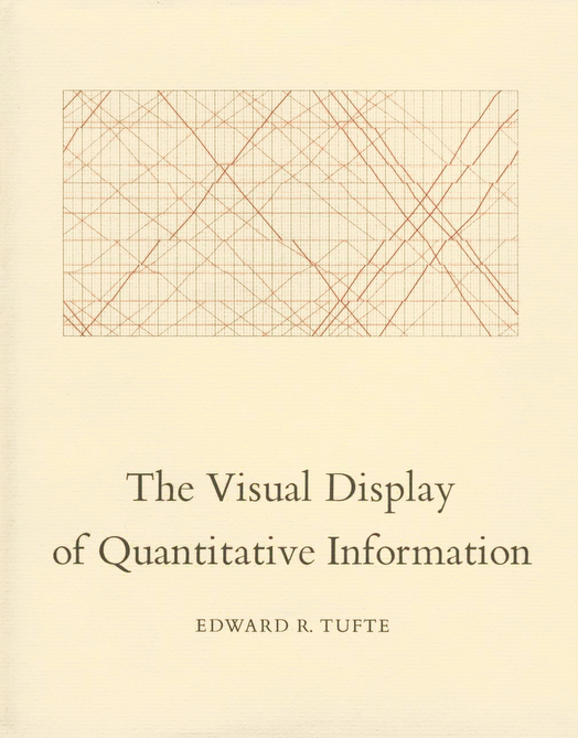
tufte-the-visual-display-of-quantitative-information.png

In the perennial classic, The Visual Display of Quantitative Information, Edward Tufte says, “Graphics reveal data. Indeed graphics can be more precise and revealing than conventional statistical computations.” There’s a lot to unpack in that statement. What counts for “graphics” (much less good graphics)? Text? Icons? Pictures? And “reveal” is an interesting word too. It’s clearly more than just visual representation. It’s about making something known that was previously unknown. And stories are great at helping us reveal things to others.

To convey information as a story, we must do several things that also help us make more effective graphics and presentations:

  • Be as simple and clear as possible
  • Focus on the main characters (subject matter)
  • Organize sensibly

…and so on.

Any old chart can convey data. The promise of the infographic is to go further—to reveal. And good infographics do. There’s a reason Hans Rosling is as well known to presenters as he is to those who work with socioeconomics, health and other information about the world. He is a master of conveying research and data in powerful, memorable ways. Inevitably, his presentations and the supporting graphics and infographics tell a story and he gets rid of everything that doesn’t help communicate that story effectively.

Hans Rosling finds and presents world data points in succinct, clear, memorable ways. With laser focus, he tells the data’s story.

Our communications—including the infographics and other visuals we use to support our presentations—become clearer, more memorable and more powerful when guided by the story form.


Presentation Skills Tip: Simplify and Be More Dramatic

Simplify and be more dramatic. Such a small and simple suggestion. Yet, it’s a great tip to keep in mind. And it really brings together several important presentation skills elements—including, for example, aspects of The Five Visual Delivery Skills and The Four Audible Delivery Skills. It’s also a way to extend the impact of the Persuasive Presentation Model we so often recommend.

The Persuasive Model for presentations helps presenters increase audience engagement. Its logical structure builds a sense of need for the solution that the presentation then showcases. But if the presenter shifts from problem to solution without any notable emphasis in delivery, the helpful effect of the structure is muted. If the titles on the accompanying visuals do little or nothing to announce the change, there’s even less chance of impact. Worse yet, some presenters will eagerly rush in to explain the wonderful details of their solution—before stating simply and clearly what it is.

The moment when a presentation shifts from describing the problem to offering the solution is a wonderful opportunity for the presenter to put good delivery skills and visuals to work. And it's an opportunity for the audience to feel reenergized and relief as you delivery the solution. Don’t squander the moment. Transition from the problem to the solution with some drama and emotion.

Try this: Before you move to the solution, summarize the problem as simply and clearly as you can. Get your audience ready and all but asking for your solution… “Is there a better way?” Then, pause for a second or two. Then, use some of those 9 delivery skills, and announce with some emotion that there is a better way. Move to your next visual—showing a clear message capturing the solution (you'll get to explain it in as much detail as you want a moment later).

That simple adjustment can make a tremendous (err, dramatic) difference in the power your presentation has on your audience.


Presentation Skills Tip: The Four Audible Skills

We first covered the five visual delivery skills: movement, stance, hands, gestures, and eye contact.  We now turn to the four audible delivery skills for presenters.

There are four audible presentation delivery skills: 

  1. Volume
  2. Speed
  3. Animation
  4. Non-words

VOLUME: Talk louder than what you think is appropriate. You never come across as loud as you think. 

SPEED: Don't slow down, pause more. The human brain can hear 700 words per minute, but no one speaks that fast. No matter how quickly you speak, never slow down. Instead, pause more. The passion goes out of your voice when you slow down. And you need to give your audience thinking time to digest what you've said. 

ANIMATION: The tonal fluctuation in your voice gives your voice passion and interest.  It gives people the impression that you truly believe in what you’re talking about. Our voices tend to flatten out and drop down when we're nervous or when we're saying something serious.  Our voices become a monotone.  And we perceive monotone voice sounds as dull, boring, and generally not as worthy of our attention.

NON-WORDS: Avoid verbal fillers in between thoughts.  As speakers, we tend to get nervous about silence.  Often when we lose our spot or at the end of sentences, we feel like we must add in a non-sensical sound (or a real word like “and”).  By tying together thought after thought with constant sound, we rob our audience of time to digest what we're saying and sound less authoritative on the subject matter.


Presentation Skills Tip: The Five Visual Skills

There are nine major presentation delivery skills and we describe five of them as “visual.”

  1. Movement
  2. Stance
  3. Hands
  4. Gestures
  5. Eye Contact

In this short video, Joe Friedman explains how each of these five visual presentation delivery skills impact the presenter, presentation, and audience.


Presentation Tip Nervousness: You Use It or It Uses You.

I spend well over 100 days in the classroom every year delivering training.  I get nervous every time I have to stand-up in front of the group.

Our fear of nervousness and that it will show in some way is what people are most concerned about. They are amazed time and time again that the nervousness they feel just doesn't show.

Unless people do something overt that says “I am horribly uncomfortable here,” it just doesn't show.  They don't see their heart pounding. They don't see sweat pouring off of themselves.  And you might think it's a simple thing.  Yet, our biggest fear is that we’ll seem nervous.

In performance terms, it’s performance anxiety. I need to get up in front of the group, I look at everyone in the group, and it creates pressure.

The good news is that there are all sorts of ways to burn off nervousness.

  1. Push more energy out.
  2. Be loud! Be as loud as you possibly can.
  3. Use your hands as much as possible.

The more energy you push out, the less nervous you will appear.  And, more importantly, the less nervous you will feel.  

There two things we say about nervousness: You use it or it uses you.

If you try to keep it in, it's coming out.  And it will come out in a way that’s not going to make you look very good.

Find a way to burn it off!


Presentation Tip: Make It a Story

When you make a story out of what you’re trying to convey, your audience often has a better chance of understanding what you meant and remembering what you said.

Almost any subject is easiest to grasp as a story. But technical topics, math formulas, and other detailed or abstract concepts tend to benefit especially when technical people must present their less technically-oriented counterparts.  

In this short video clip, David Zehren shows how a statistical topic like “standard deviation” becomes easier to understand and relate when it’s made into a story.


Presentations Should Be Persuasive

Most presentations should persuade. The interactive nature of persuasion tends to help an audience engage with the presenter and the presentation’s content. Even when the main purpose of the presentation is simply to convey information, it is often useful to at least consider the persuasive model rather than the informative model. 

In this video clip, David Zehren recounts a client’s war story to remind us to consider whether our presentation should use the persuasive model.


Helping Techs Make Better Presentations Webinar Part 1 {video slides}

Can your technical people talk to your money people?

Here’s the first part of a webinar David Zehren recently presented to the International Institute of Analytics (IIA).

Special challenges await technical presenters who must address their less technically-minded counterparts. In this first part, David outlines the four major challenges technical presenters face and he begins to outline tips for overcoming those challenges.

ZEHREN♦FRIEDMAN offers a hands-on Presentation Skills course designed to help technical presenters make better presentations and communicate more effectively: “HT3M2: Helping Techs Present to Mere Mortals”.

Contact us for more information about how we help techs talk to mere mortals.

Why Bad PowerPoint Visuals Happen and How to Make Them Better Webinar Part 2 {video slides}

Why Bad PowerPoint Visuals Happen and How to Make Them Better

Here’s the second part of a webinar David Zehren recently presented to the International Institute of Analytics (IIA). The first part is here in case you missed it.

Special challenges await technical presenters who must address their less technically-minded counterparts. In this second part, David highlights a major cause of bad PowerPoint visuals—espeically the kinds of bad visuals that frequently plague more technical presentations face. He also offers a simple technique for avoiding this common cause of bad PowerPoint visuals.

ZEHREN♦FRIEDMAN offers a hands-on Presentation Skills course designed to help technical presenters make better presentations and communicate more effectively: “HT3M2: Helping Techs Present to Mere Mortals”.

Contact us for more information about how we help techs talk to mere mortals.

10 Tips for Creating Better PowerPoint Slides Webinar Part 3 {video slides}

10 Tips for Creating Better PowerPoint Slides and Using Your Deck More Effectively

Here's part 3 of a webinar David Zehren recently presented to the International Institute of Analytics (IIA) on "Helping Techs Talk to Mere Mortals."

In this segment, David Zehren outlines 10 tips for making better PowerPoint slides and for using them more effectively—especially in more technically-oriented presentations.

Special challenges await technical presenters who must address their less technically-minded counterparts. ZEHREN♦FRIEDMAN offers a hands-on Presentation Skills course designed to help technical presenters make better presentations and communicate more effectively: "Helping Techs Talk to Mere Mortals."

 Contact us for more information about how we help techs talk to mere mortals.

The Top 4 Challenges Presenters Face

Top 4 Challenges Technical Presenters Face

As we developed our Presentation Skills for Technical Presenters and our Helping Techs Talk to Mere Mortals seminars we identified four challenges that are especially troublesome for technical and analytical presenters, albeit, not unique to them.

This four-part series considers the four biggest challenges facing presenters who make highly technical, detail or data-driven presentations. It’s true that these pitfalls await any unsuspecting presenter regardless of the presentation’s content and focus. But the dry abstraction inherent to more technical presentations adds to the obstacles. Luckily, these obstacles help remind us of opportunities to become even better communicators.


Technology has made us lousy listeners.

Top 4 Challenges Technical Presenters Face
This four-part series considers the four biggest challenges facing presenters who make highly technical, detail or data-driven presentations. It’s true that these pitfalls await any unsuspecting presenter regardless of the presentation’s content and focus. But the dry abstraction inherent to more technical presentations adds to the obstacles. Luckily, these obstacles help remind us of opportunities to become even better communicators.
We posted about a challenge each week. Here’s the first one…

Technology has made us lousy listeners.

Top 4 Challenges Technical Presenters Face, Part 1

We've become lousy listeners. Technology—especially smartphones, tablets, etc—puts worlds of distractions in front of us wherever we are. And email, text messaging and social networks all but command our attention at any time and place.

Consider:

  • If we’re both looking at the same slide and I can read it twice as fast as you’re reading it to me, I can blow through that slide, update my Facebook status, reply to an email or two, and Google that whatsit that just came to mind — all before the first bullet on your next slide.

  • If your presentation to me gets too deep into details and data I know I’ve got in a PDF whitepaper on the topic, I might as well start keyword-searching through that — if you’re lucky — else, there’s probably another email or two I can knock out.

  • And so on…

Worst. Listener. Ever. Sure, I’m your worst nightmare for an audience. But don’t dismiss my lousy listening without first considering the possibility that you helped make me that way. At least admit you gave me some pretty good reasons toshare my focus.

More importantly, all of this suggests some things we can do as presenters to avoid the problems of lousy listening. And if our content is filled with technical specifications, detailed data, and analysis — we must do all we can to earn the attention of our audience and to keep it.

Yes, of course, present with passion and energy. Yes, make eye contact when presenting in person. Check in with your audience when presenting online or by phone. But also:

  • Let’s be mindful of the fact that people have always been lousy listeners — and there are now even more compelling distractions. Even worse, sometimes our lousy listening feels justified — or at least not without reason.

    So, it’s as important as ever to hone your message and deliver your presentation to captivate me. But it’s even more important than ever not to justify my lousy listening habits.

  • Be sure your presentation makes good use of “now” and “later” piles. Most of the research, details, and comprehensive analysis leading up to and fueling your presentation is very important, no doubt. But how much of it is crucial to present right here, right now? It can be very helpful to really pare down to the now nut. Then save the rest of that rich, detailed information in your later pile.

    Put it in a follow-up document, make it available for your audience to comb through later if they’d like, put it in an appendix in your slide deck — or in the “Notes” section. I don’t doubt that it’s all good, but I suspect it’s not all needed now.

Next time we’ll consider the second key challenge technical presenters face: too often, technical presenters use bad visuals that can make a presentation worse than no visuals at all.

ZEHREN♦FRIEDMAN can help your data denizens and science sleuths be more effective communicators with a presentation skills seminar designed specifically for technical presenters: Helping Techs Talk to Mere Mortals is a two-day, highly experiential, hands-on seminar for six to ten people.

Contact ZEHREN♦FRIEDMAN for more information. Or read more about other Presentation Skills courses.